A shirt can look lively in real life and overwhelming in a profile thumbnail. That is especially true for dense stripes, busy checks, small florals, or high-contrast patterns. The answer is usually not to ban prints. It is to make the face easier to read and the pattern easier to understand at small size.
What to remember todayKeep the pattern if you like it, but give your face more visual space and check the photo at the small size people will actually see online.
Small screens compress patterns
On a phone, tight stripes or tiny checks can blur into visual noise. A pattern that felt lively in person may turn into one busy shape once it is shrunk down.
The smaller the image, the more important contrast and spacing become. If the pattern is already doing a lot, the rest of the frame should do less.
Give the face more quiet space
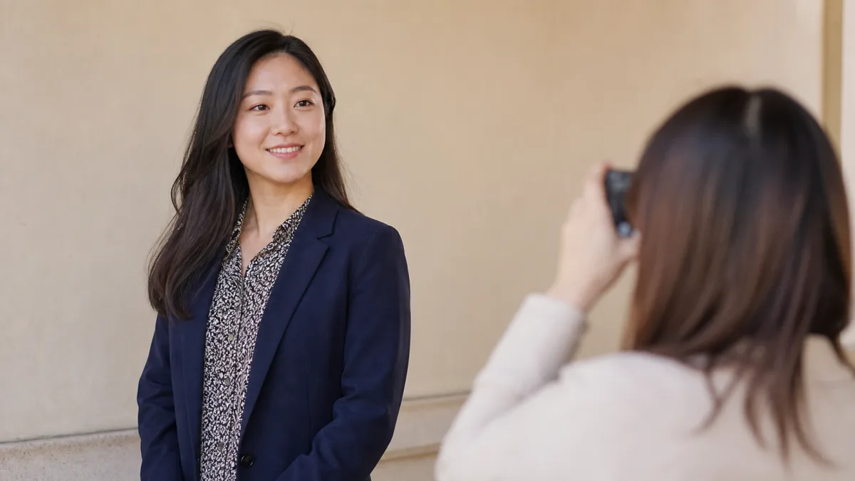
A solid jacket, open collar, simple neckline, or unbuttoned layer can create room around your face so the photo feels readable. You do not need to hide the pattern; you just need to stop it from crowding your expression.
If the print includes a color that is friendly on your face, you can echo that color in a more subtle piece instead of adding another strong pattern.
Let the photo have one job
If the goal is a profile headshot, the main job is recognition and warmth. If you want the print to show your taste, give that to a second photo rather than asking one image to do everything.
People do not need your outfit to prove that you have style. They need to see your face, your expression, and enough of your real life to feel curious instead of overloaded.
Check the thumbnail, not just the mirror
A print that looks balanced in a full-size mirror can overwhelm a tiny app image. Shrink the photo before you decide. If the pattern speaks louder than your eyes, scale the pattern back or pick a different shot.
This is a technical choice, not a judgment on the print itself. Some pieces belong in a full-body photo, not the first profile image.
Say it clearly and briefly
- I like the print, but I want my face to be the first thing people notice.
- Let me check this at thumbnail size before I decide.
Responses that make things harder
- Using a dense pattern as the first profile image without checking the thumbnail
- Adding more strong makeup to compete with the outfit
Compare the same photo at full size and thumbnail size, then choose the version where your face stays readable first.
Before you decide
- Did I check how the photo looks at thumbnail size?
- Did I create quiet space around the face?
- Did I avoid layering several competing patterns?
- Did the image still feel like me?