
You pick a photo because your smile looks good in it, then the app preview makes your skin look tired and your face look gray. That can feel like a personal failure, but it is usually a camera and styling problem. The light, the shirt, and the background are all talking at once, and your face gets lost in the noise.
What to remember todayUse soft front light, a simpler background, and a top that is not darker or louder than your face so the photo reads as you, not as the room around you.
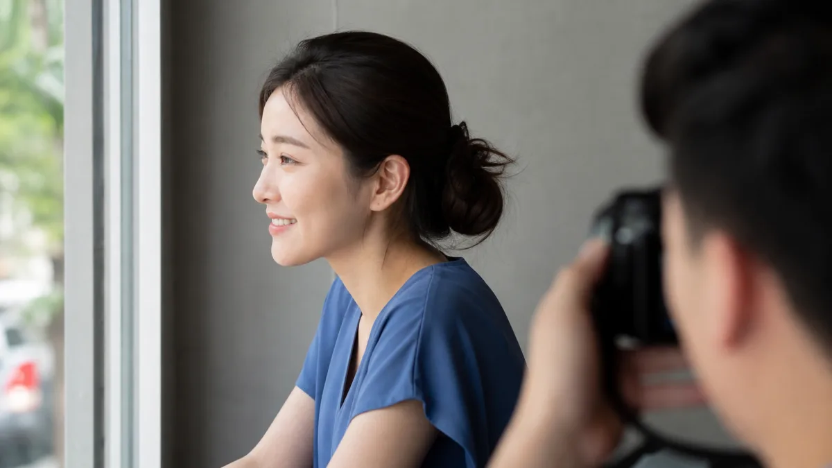
Start with the light before you blame your face
Overhead indoor light and mixed color temperatures can cast shadows under the eyes and around the mouth. If the picture was taken under a ceiling fixture or near a bright window behind you, the camera may have flattened your skin tone.
Try again in open shade or near a window with the light coming from the front or slightly to one side. On a phone camera, the gentler light usually matters more than chasing a more expensive-looking location.
Let the shirt support your face instead of competing with it
Very dark tops can drag the lower half of the frame downward, while very bright or neon colors can take over the image. A mid-tone solid shirt is often a safer starting point for dating profile photos.
That does not mean everyone needs the same palette. On a diverse U.S. audience, the real question is whether the shirt helps your face stay visible and relaxed across your own skin tone, hair texture, and styling choices.
Keep the background quiet enough to disappear
Busy café walls, bright signage, or strongly colored murals can pull attention away from your expression. A cleaner background gives the app less material to distort and gives your face more room.
If you want a lived-in feel, one or two details are enough. The best profile photos usually look intentional, not staged with every object in the room.
Compare versions instead of chasing one perfect shot
Take a few photos with only one thing changed: shirt color, lighting angle, or background. Then compare which version makes your eyes, mouth, and skin look more rested.
The goal is not to look lighter, thinner, younger, or more “ideal.” It is to look clear, current, and easy to recognize when someone meets you offline.
Say it clearly and briefly
- Let me compare this photo in softer light before I decide it is bad.
- The face is not the problem here. The shirt and lighting are doing too much.
Responses that make things harder
- Assuming one dull-looking photo means your coloring is wrong
- Using heavy filters that make the photo stop looking like you
Retake one profile photo in front of a window, change only the shirt color once, and compare which version keeps your face most readable.
Before you decide
- Was the light soft and mostly in front of the face?
- Did the shirt stay calmer than the face?
- Did the background stay simple enough to fade out?
- Did I keep the image realistic instead of heavily filtered?